- Get started
- About
- Supported fields
- Configuration
- Introduction
- Pages
- Templates
- User Scopes
- Permissions
- Settings
Page editor
Learn how you can tailor the Page’s design to your needs
Before you start, log in as a user with Jira Administrators global permissions. For more information, see Atlassian documentation.
After adding a Page, you can manually change all the details of its currently applied template and add various elements for better customer experience.
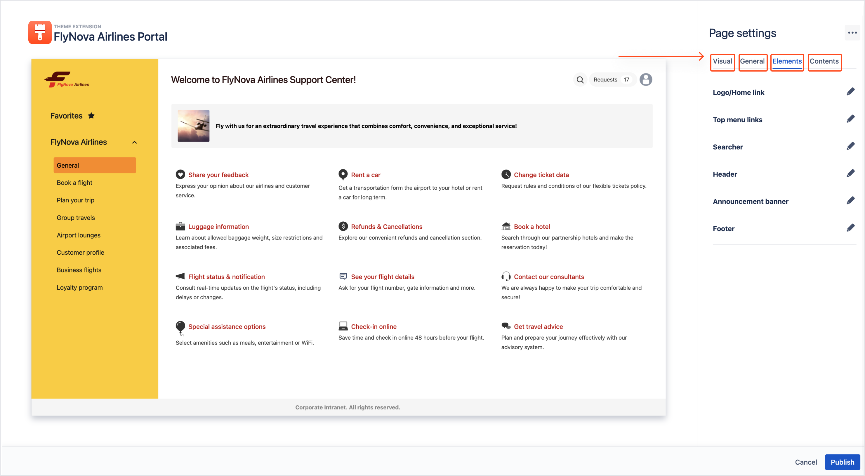
In the Page editor, customization occurs in the following categories:
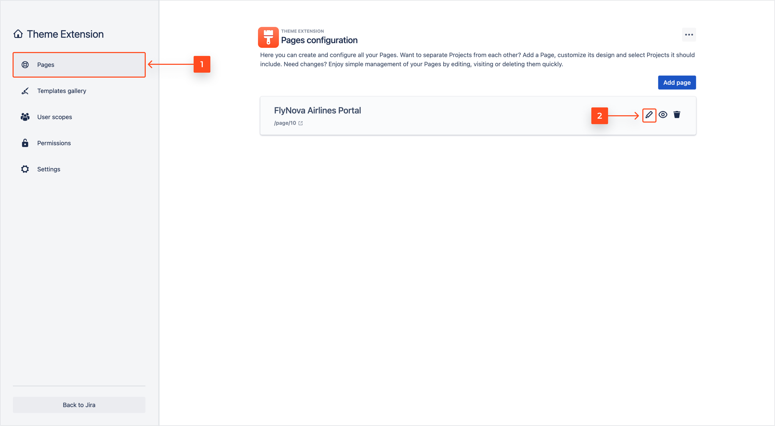
Accessing the editor
Steps
Result
Page editor is accessed. You can now see the currently applied template.
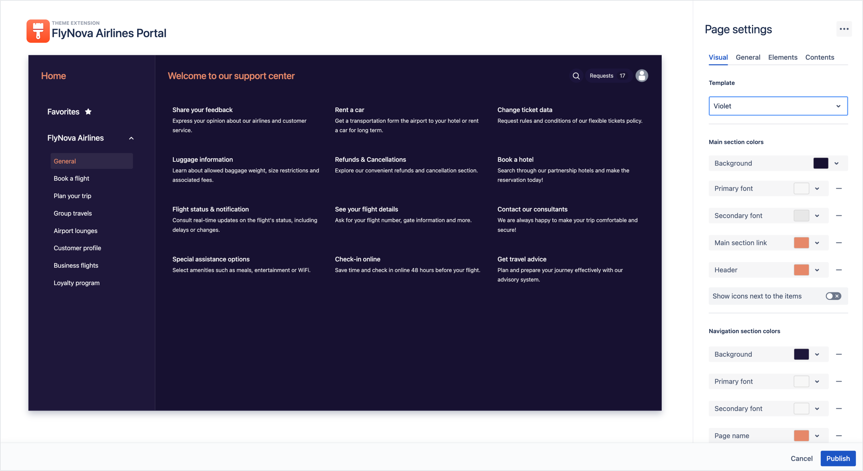
Visual
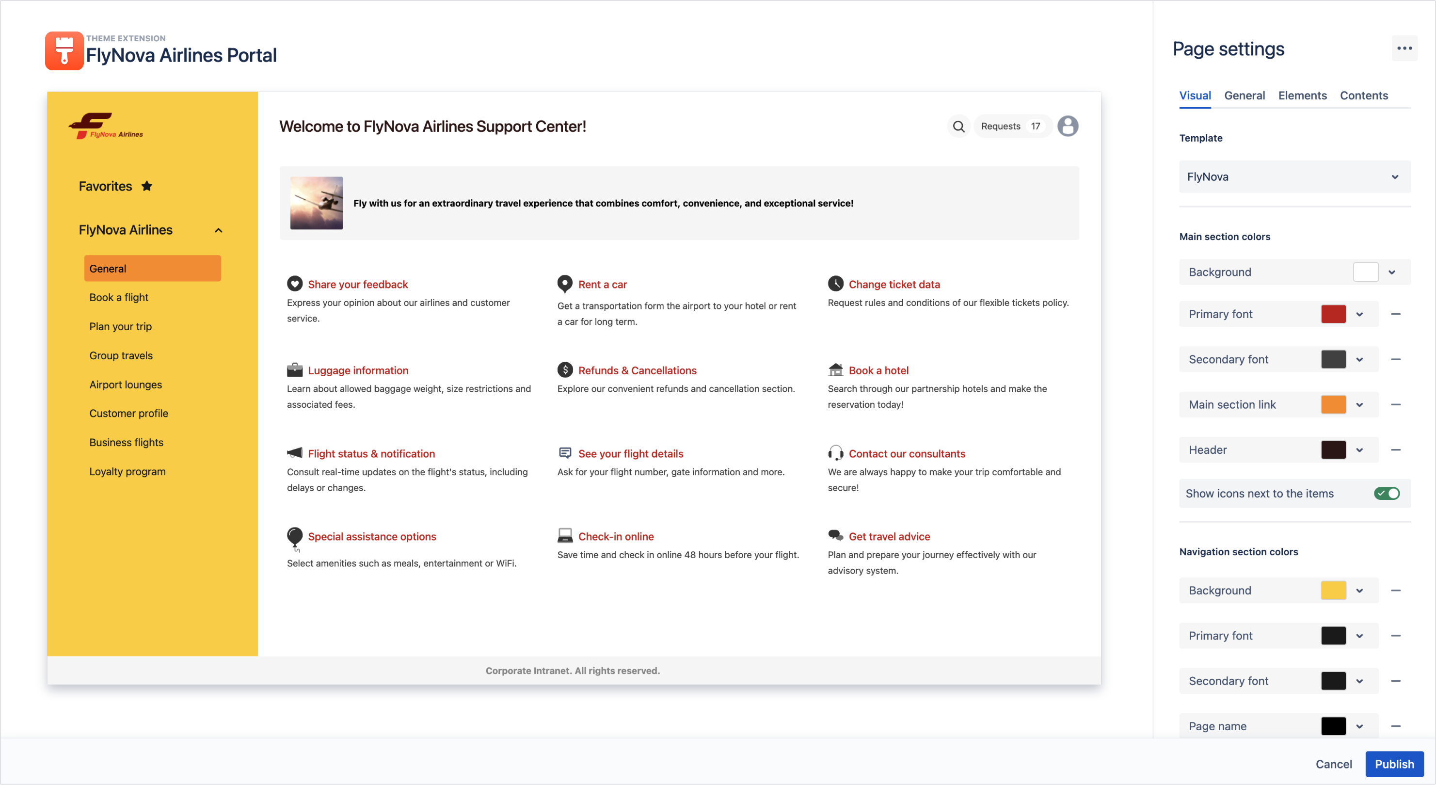
Visual category lets you change the active template and configure colors of both sections along with fonts and headers.
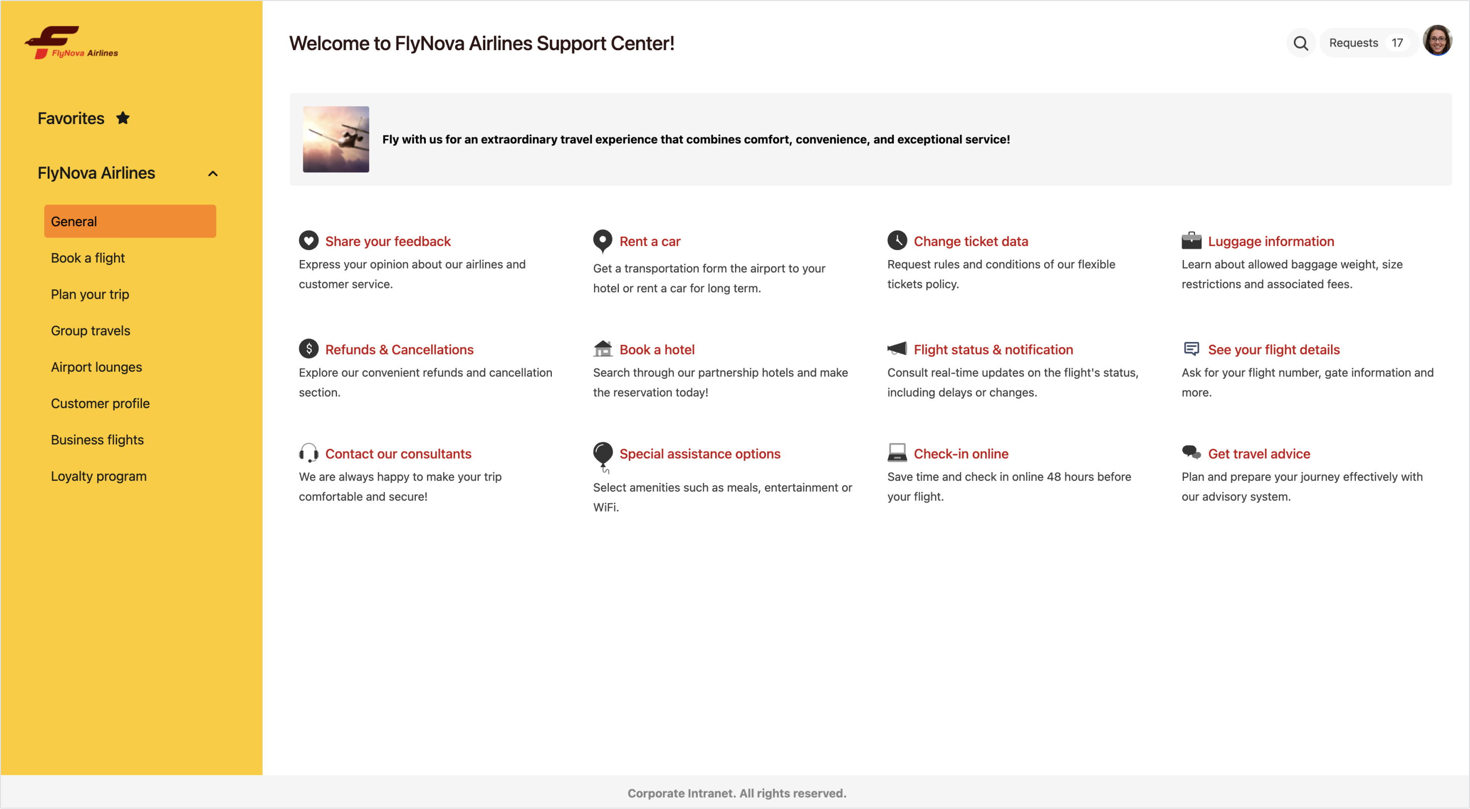
Below you can see a Page with highlighted components and their names so that it’s easier to find your way around the editor.

- Main section
- Navigation section
- Primary font
- Secondary font
- Main section link
- Header
- Page name
- Selected element
Any change in the Visual category will automatically switch the active template to Custom which can later be saved as a new template in order to preserve the already existing ones.
Steps
- Set the colors of the Main section using the color picker, HEX code, or RGB codes.
- Turn on the toggle if you want the request type icons to be visible on the Page.
- Set the colors of the Navigation section using the color picker, HEX code, or RGB codes.
Navigation section colors can also inherit the color composition from the Main section background color.
Result
The visual layer is configured, you can now proceed to edit the General settings.
General
In the General category, you can change the name of the Page which is visible on the configuration panel. In order to do so, click on the text field and start typing.

Page name can be maximum 48 characters long.
You can now proceed to adding Elements to your Page.
Elements
With Elements you can insert additional information that will be displayed on your Page. Each Element is unique to each Page and can be configured only in the Page editor.
Currently, there are five configurable Elements:
- Logo/Home link
- Searcher
- Header
- Announcement banner
- Footer
Logo/Home link
Steps
- Click on the pen icon to expand the Logo/Home link panel.
- Choose the text of the link with up to 48 characters. Alternatively you can upload an image using drag and drop or by browsing files.
Note
Supported formats are JPG, JPEG, PNG, HEIC.
- Choose the target of the link.
- Click Save.
Result
Logo and Home link are configured.
Searcher
Steps
-
Turn on the toggle if you want to add a search bar to your Page.
-
Optionally, you can create a custom Placeholder text to be visible in the search bar.
-
Set the colors of the search bar using the color picker, HEX code, or RGB codes.
Result
Your search bar is configured.
Header
Steps
- Click on the pen icon to expand the Header panel.
- Turn off the toggle if you want to hide the header from the Page.
- Change the text of the header.
- Click Save.
Result
Header is configured.
Announcement banner
Steps
- Click on the pen icon to expand the Announcement banner panel.
- Turn on the toggle to display the announcement banner.
- Choose the colors of the font, background, and border.
Note
Default colors of the announcement banner are inherited from the Navigation section colors.
- Enter the text of the banner. You can format it using the Rich text editor.
- Upload an image.
Note
- Maximum dimensions are 32x32 pixels.
- Supported formats are JPG, JPEG, PNG, HEIC.
- Click Save.
Result
Announcement banner is added.
Footer
Steps
- Click on the pen icon to expand the Footer panel.
- Turn on the toggle to display the footer.
- Choose the colors of the font and background.
Note
Default colors of the footer are inherited from the Main section colors.
- Enter the text of the banner. You can format it using the Rich text editor.
Result
Footer is added. You can now proceed to adding more service projects to your Page.
Projects
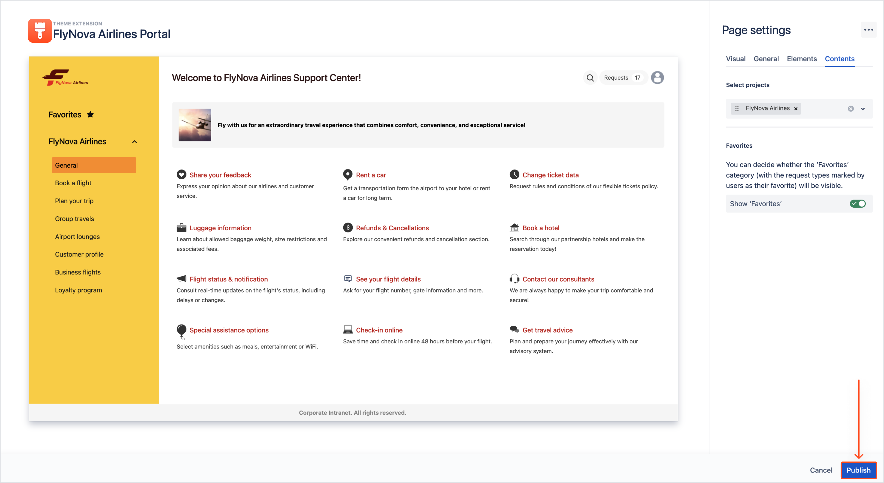
You can add more service projects to the Page that will be displayed in the Navigation section along with their request types groups.
Steps
- Click on the field to expand a drop-down list.
- Select as many projects as you want or delete the existing ones.
Note
Types of supported projects are:
- Team-managed
- Service
- Classic
Result
Projects are added.
Publishing
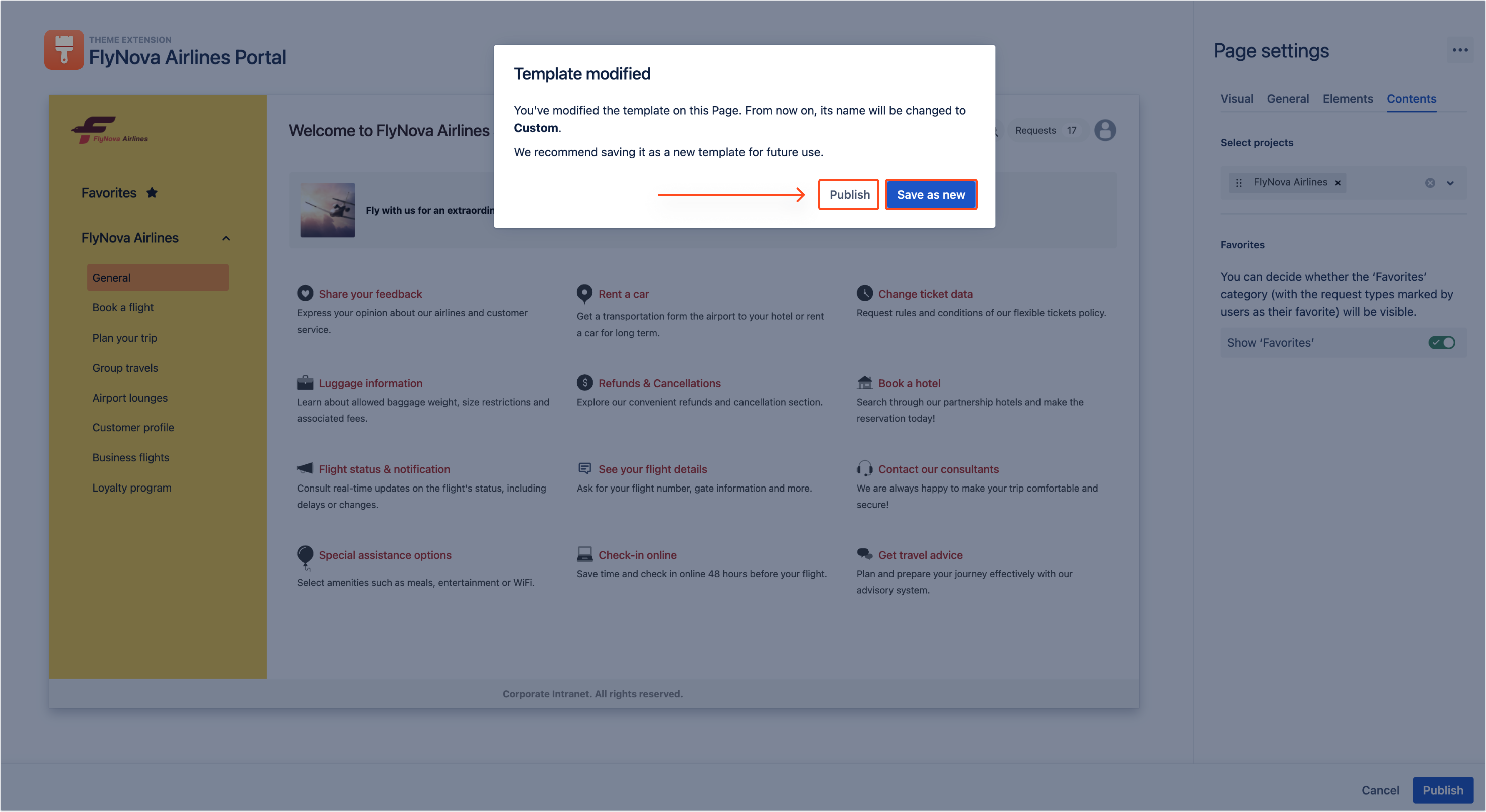
Once you’ve configured your Page, you can now publish it and make it available for customers. In order to do so, click Publish in the bottom right corner.
Click Save as new if you want to save your design as a new template. Alternatively, click Publish to make the design exclusive to the current Page.
If you can’t find the answer you need in our documentation, raise
a support request.
Include as much information as possible to help our support team resolve your issue faster.