- Working with synchronized data
- Presenting synchronized data
- Hiding attributes based on group memberships
- Using synchronized data in workflow
- Using synchronized data in JQL
- Using synchronized data in notification
Attribute Statistics
Discover how our dashboard gadget presents AD data in Jira
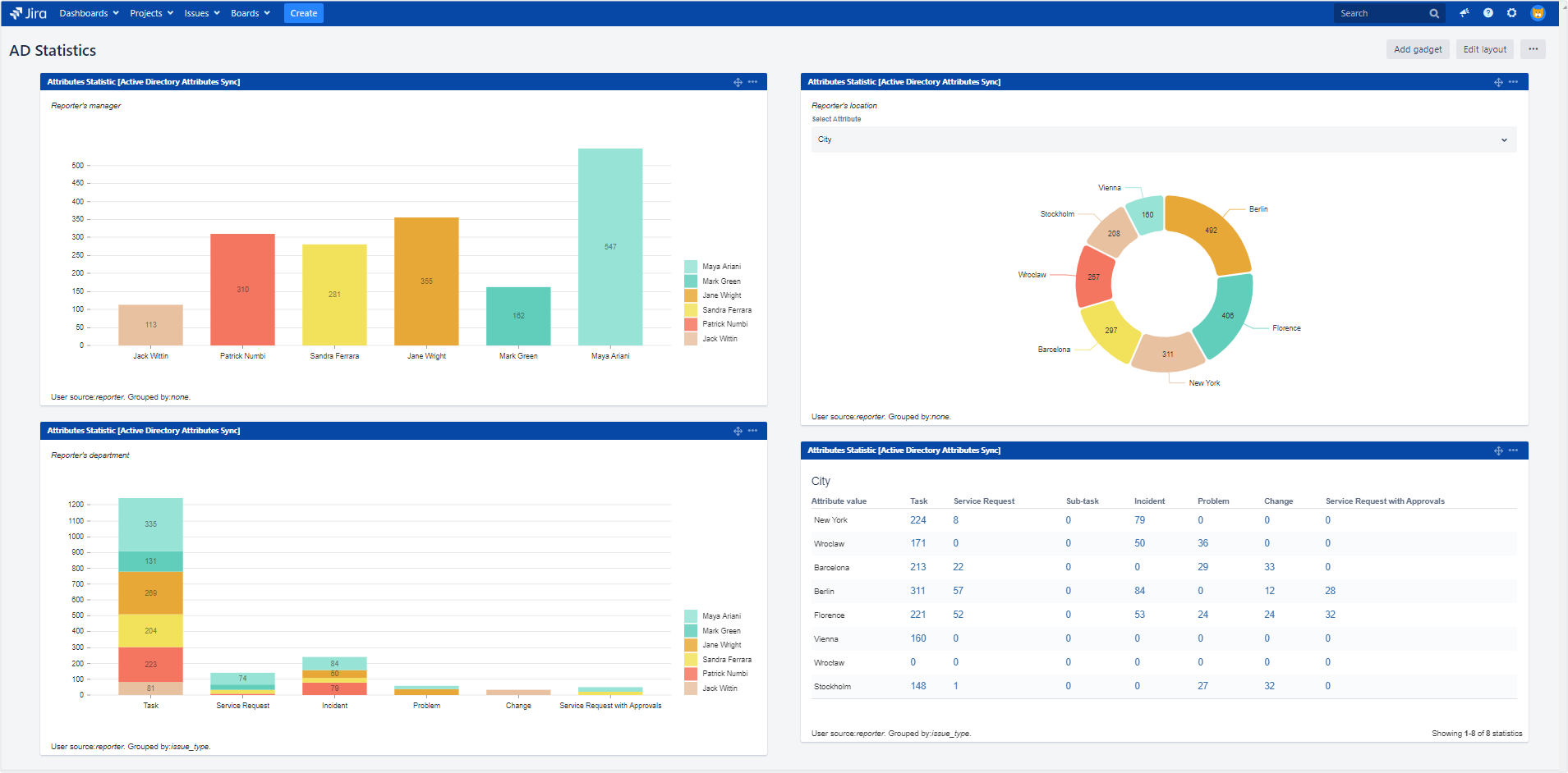
Attribute Statistics was created to visually present useful information about Jira usage and statistics.
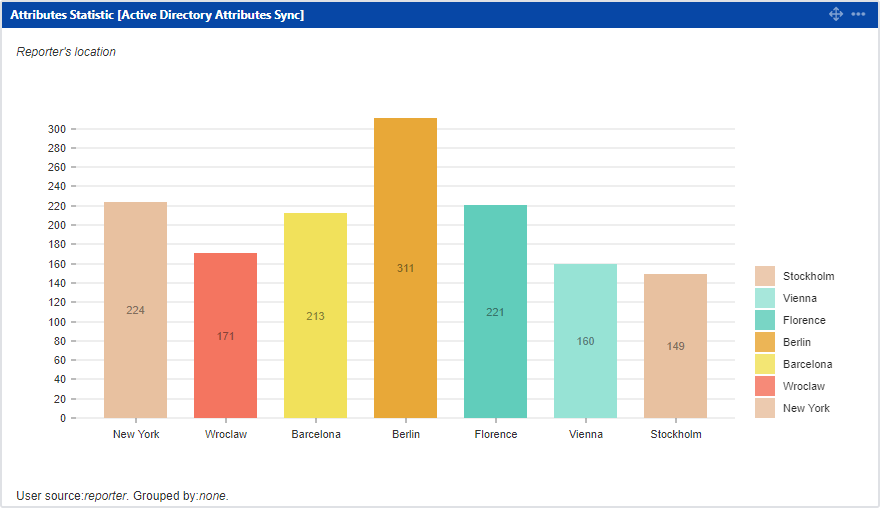
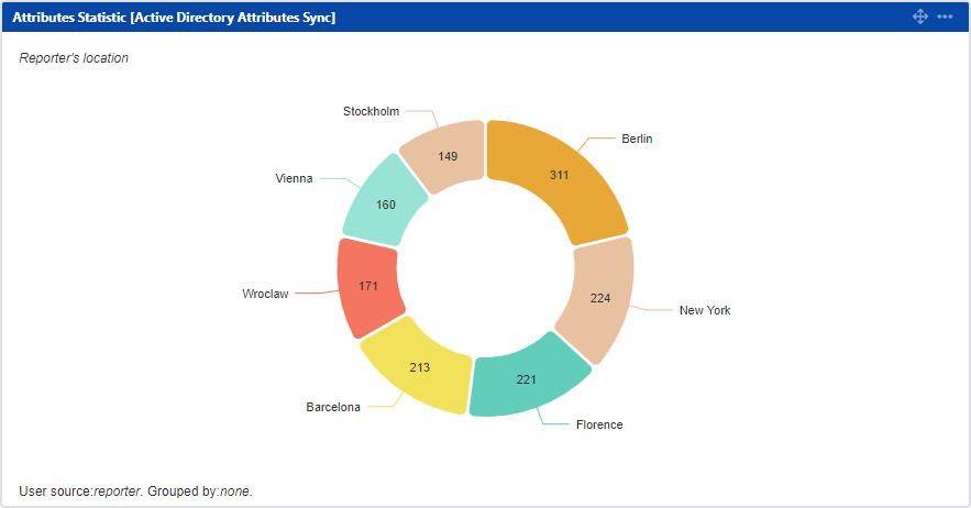
It reads users’ data from AD and shows the most important facts about issue reporters and assignees. You can check where most of the issues come from (in terms of cities, teams or roles) and display them in the form of different charts.
Adding Attribute Statistics Gadget to the Jira Dashboard
Steps
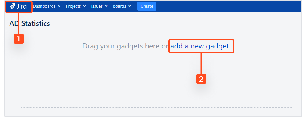
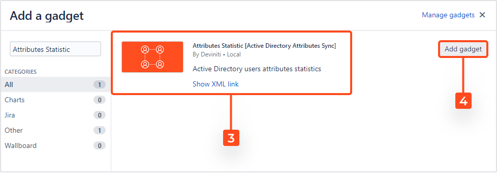
In order to add the gadget to your Jira dashboard:
-
Go to the Jira home page or to Dashboards.
-
Select or search for Attribute Statistics [Active Directory Attributes Sync].
Configuration
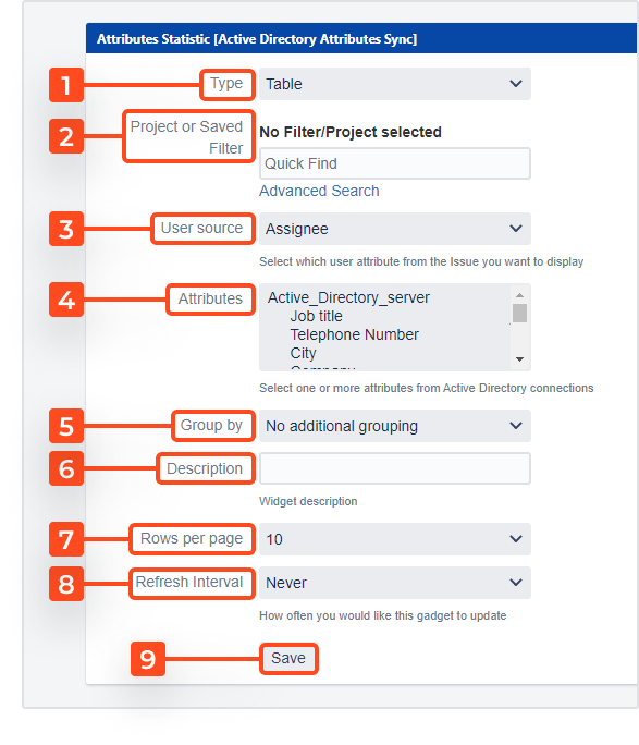
There is a lot of data you can display in multiple different forms. Scroll down to see the descriptions of each category:
-
Type
Choose how the data should be displayed. You can select one of these three visual forms:- Table
- Pie chart
- Bar chart
-
Project or Saved Filter
Select the project you’d like to analyze or create a filter to display only a certain set of information. Go to Advanced Search to see all options. -
User source
You can choose whose AD attributes should be analyzed. Select one of those two groups of users:- Assignee
- Reporter
-
Attributes
Choose the AD attributes that will become the filter criteria for your chart. In order to choose more than one attribute, press and hold the Ctrl (Control) key. This will allow you to easily switch between different graphs for different attributes in your final chart. The criteria selector will appear right above the chart. Here is a list of available attributes:- Job title
- Telephone number
- City
- Company
- Mobile Number
- Street address
- Office
- Manager
- Description
- Department
- Web Page
-
Group by
You may want to use additional categories to display a more complex set of data. Select one of the following criteria and see how they enhance your graph:- Issue type
- Project
- Fix version
- Label
- Component
-
Description
Add a short note about the data displayed in your chart. It will show up at the top of the gadget’s white space. -
Rows per page
If you’ve selected a table as the type of your chart, you can now decide how many rows to display at once. Available options:- 10
- 20
- 30
- 50
- 100
-
Refresh interval
You can choose how often your chart should be updated. Choose a setting that best fits your needs:- Never
- Every 15 Minutes
- Every 1 Hour
- Every 2 Hours
-
Click Save to generate your chart.
If you can’t find the answer you need in our documentation, raise a support request.
