- Get started
- About
- Supported fields
- Configuration
- Introduction
- Pages
- Page editor
- Templates
- User Scopes
- Permissions
- Settings
Elements
Find out about additional customized elements that can be added to your Page
With Elements you can insert additional information that will be displayed on your Page. Each Element is unique to an individual Page and can be configured only in the Page editor.
Currently, there are six configurable Elements:
Logo/Home link
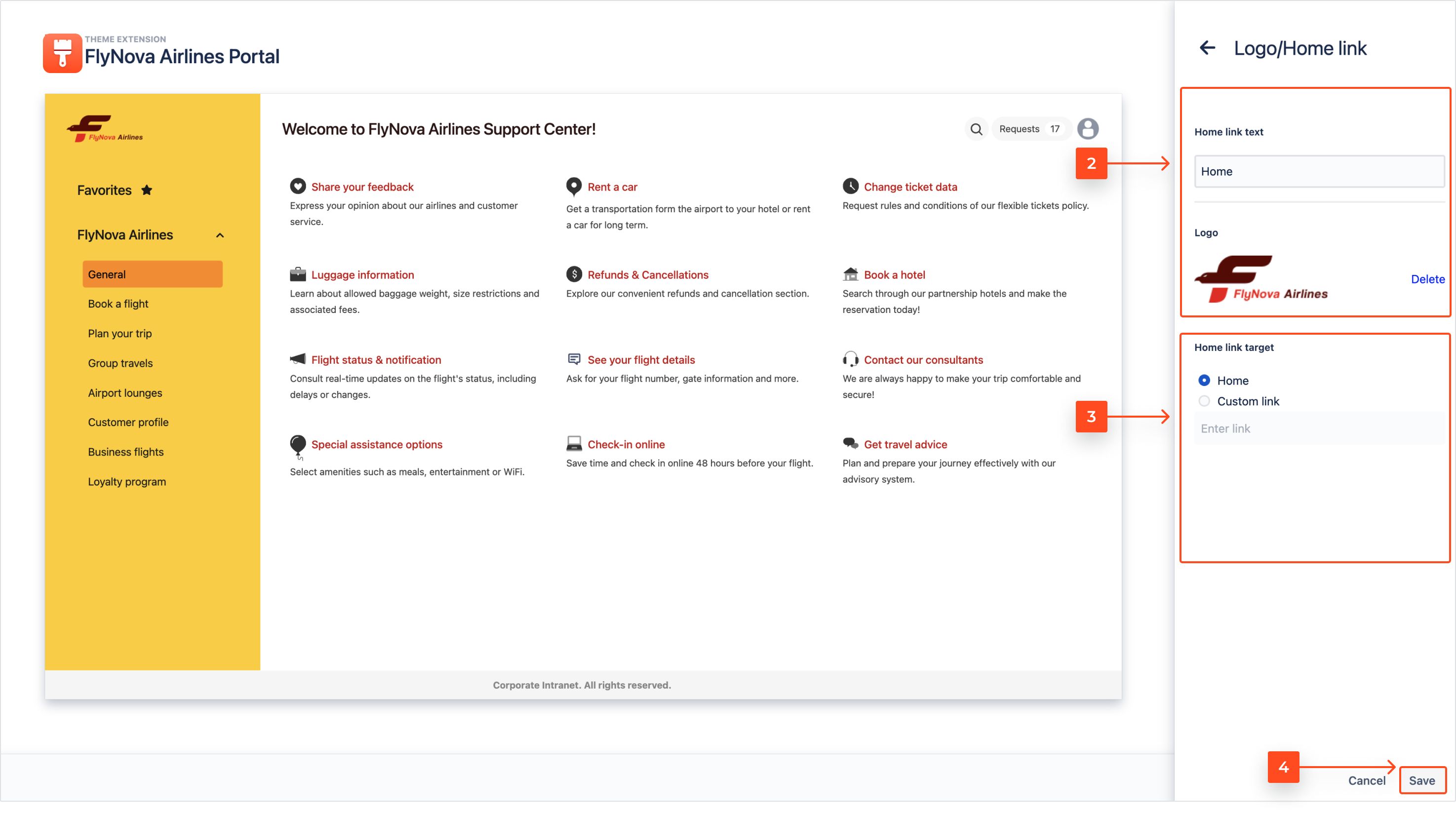
To learn about the Logo or Home link configuration, follow the steps below.
Steps
- Click on the pen icon to expand the Logo/Home link panel.

- Choose the text of the link with up to 48 characters. Alternatively you can upload an image using drag and drop or by browsing files.
Note
Supported formats are JPG, JPEG, PNG, HEIC.
- Choose the target of the link.
- Click Save.
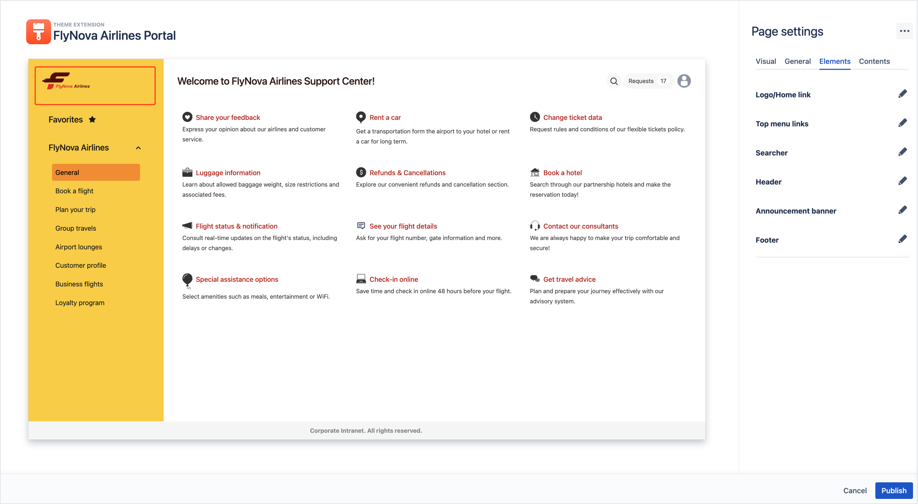
Result
The Logo/Home link element of your Page is configured.
Top menu links
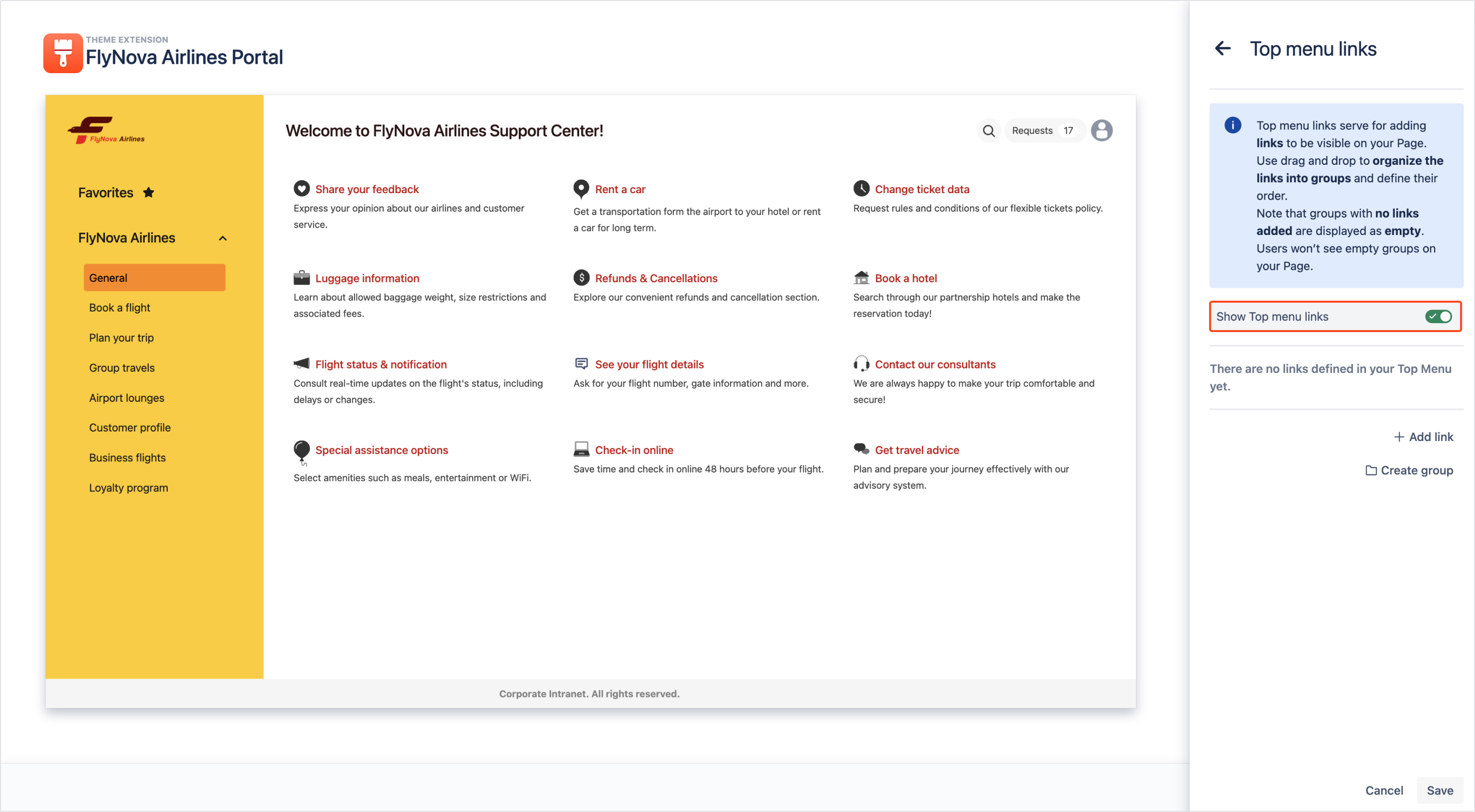
With Top menu links you can add external and internal links to be accessible by the users of your Page. It’s also possible to customize the link text in order to boost user experience and create a group of links to keep several important sources organized.
To learn about adding a link to the Top menu of your Page, follow the steps below.
Steps
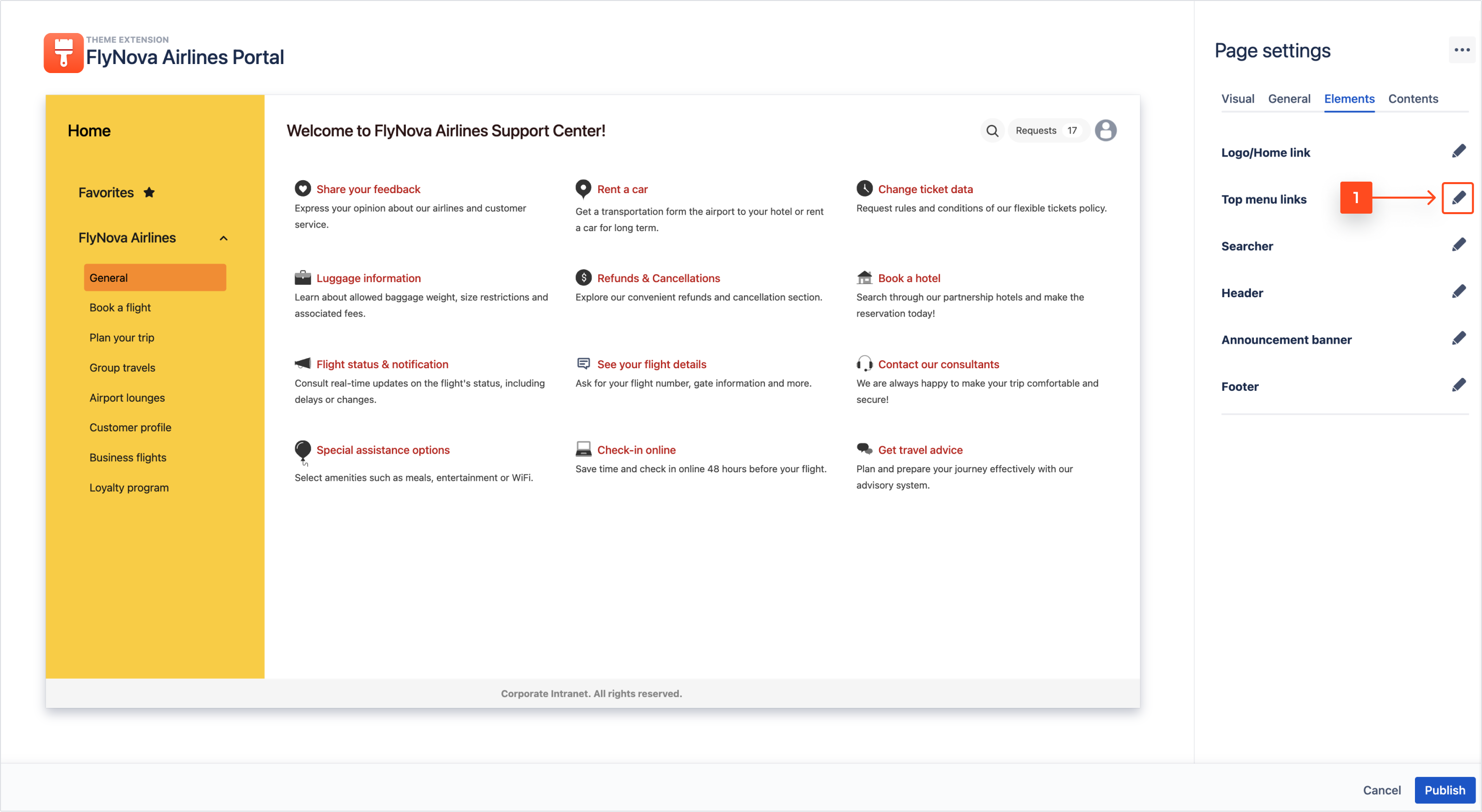
- Click on the pen icon to expand the Top menu links panel.
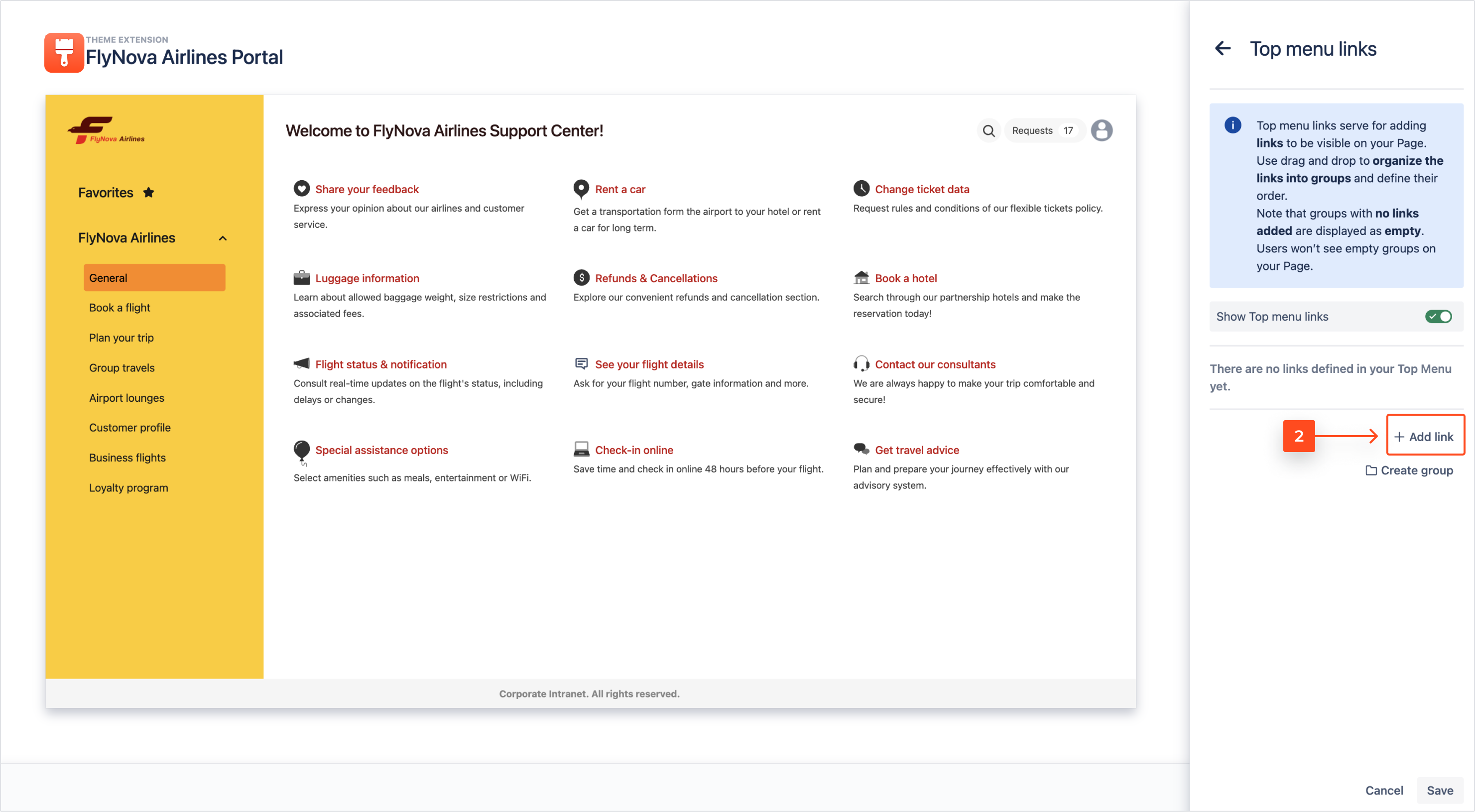
- Select the Add link option.
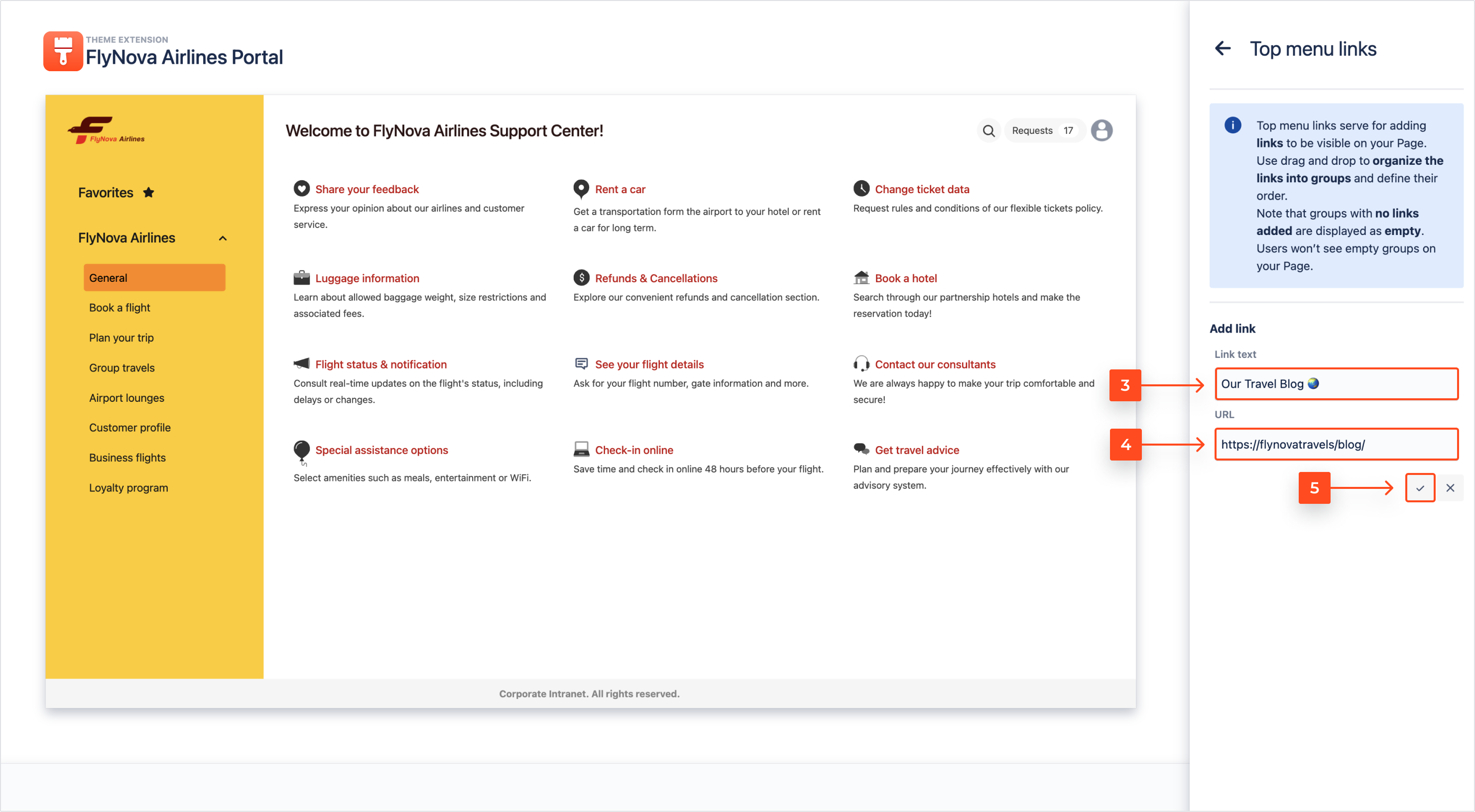
- Introduce the Link text which should be displayed on your Page.
- Enter the URL address of a chosen link.
With links you can redirect users to external websites as well as to the selected sections of Pages.
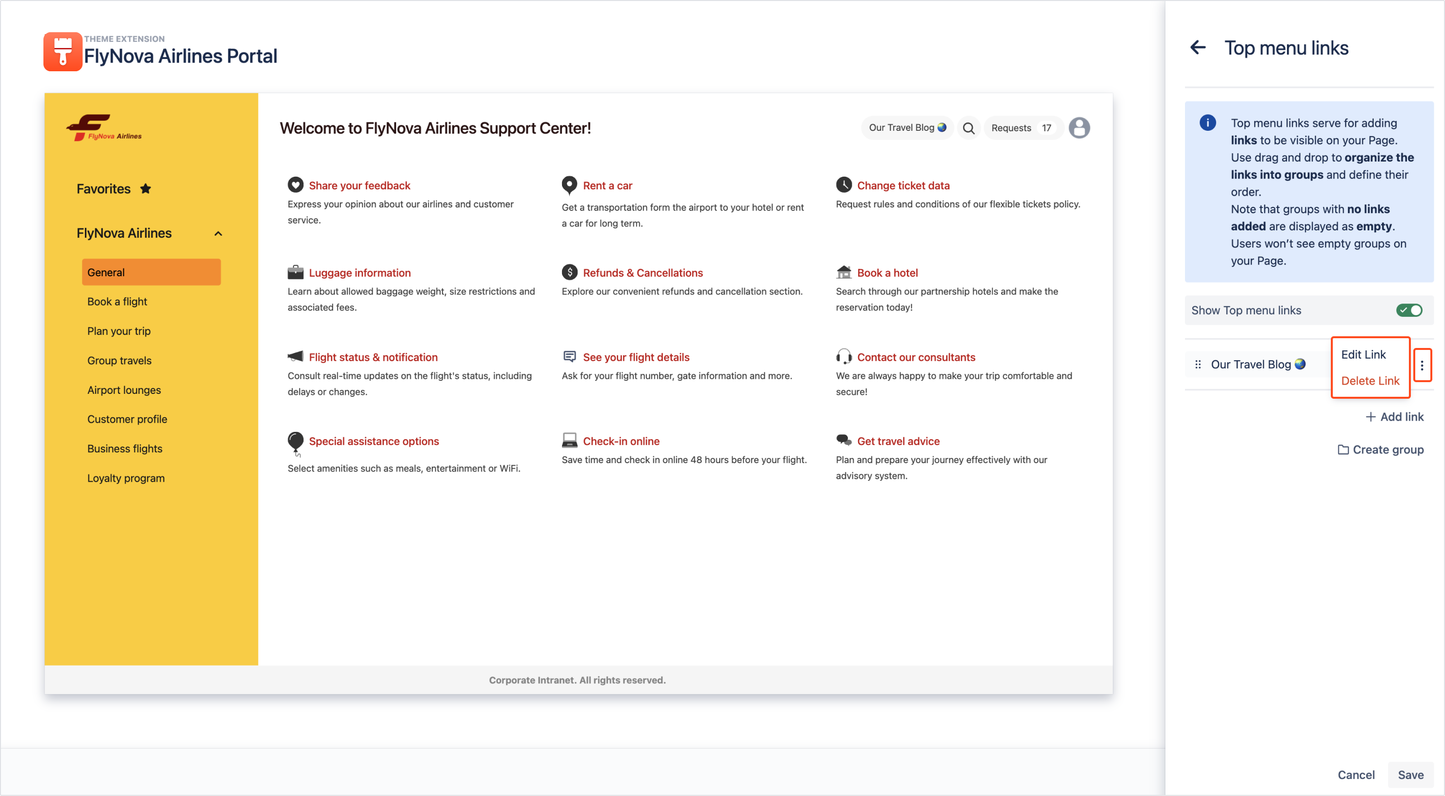
- To store the introduced content, click the tick icon.
By clicking the cross icon, the introduced Link text and URL will be permanently lost.
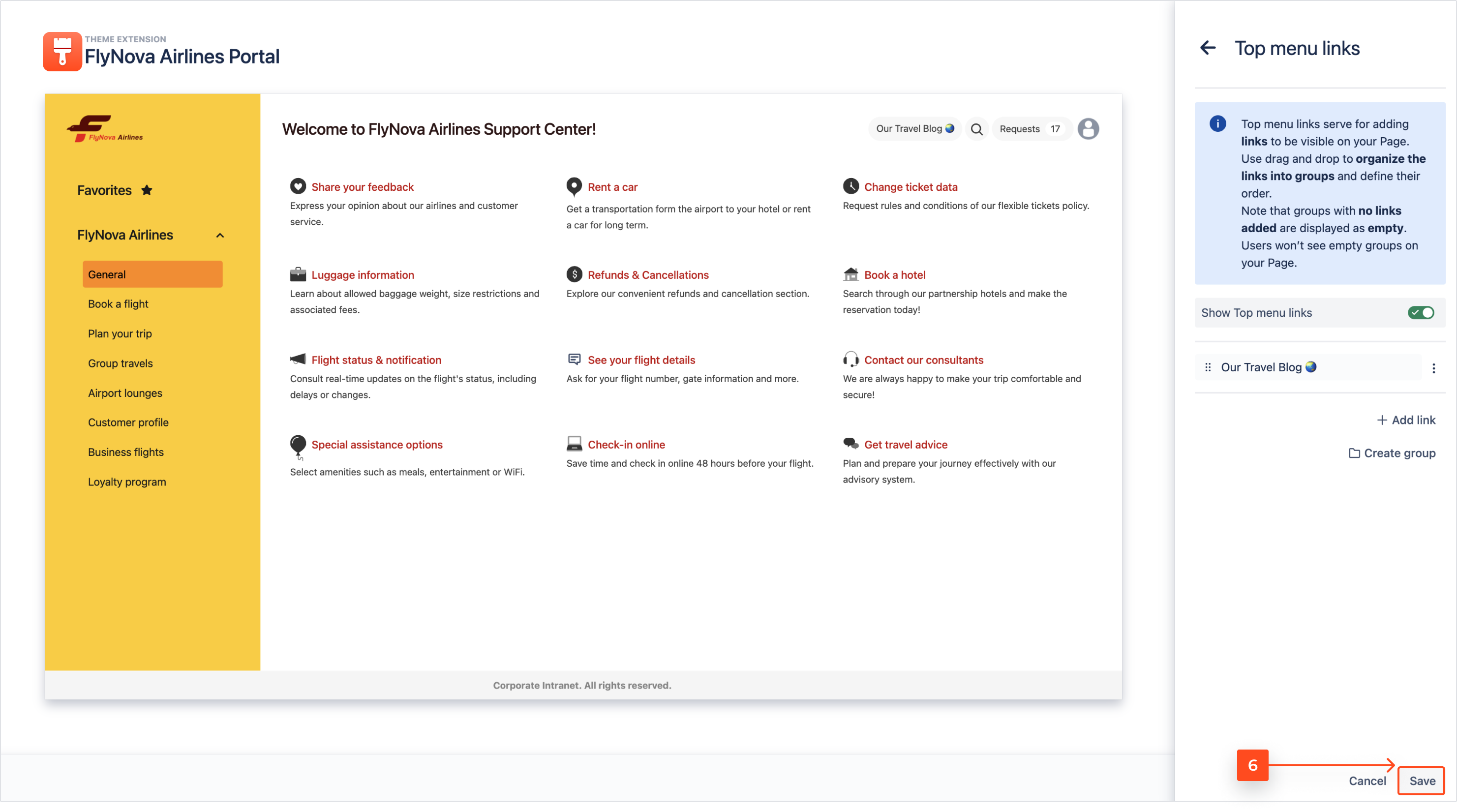
- Finish the configuration of links in the Top menu by clicking Save.
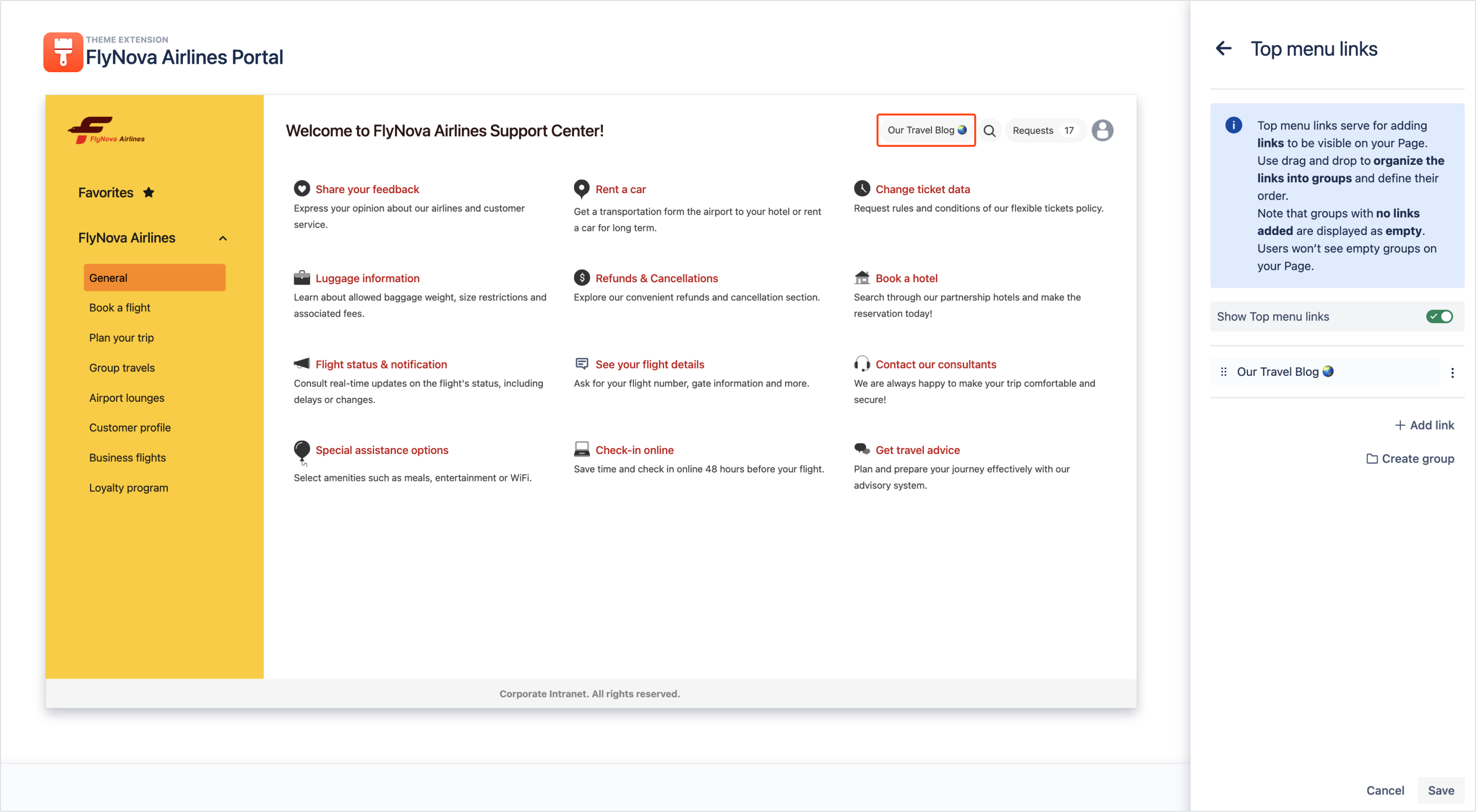
Result
The link is added and the introduced link text is displayed on your Page in the Top menu section.
To find out how to create groups with added links, go through the steps below.
Steps
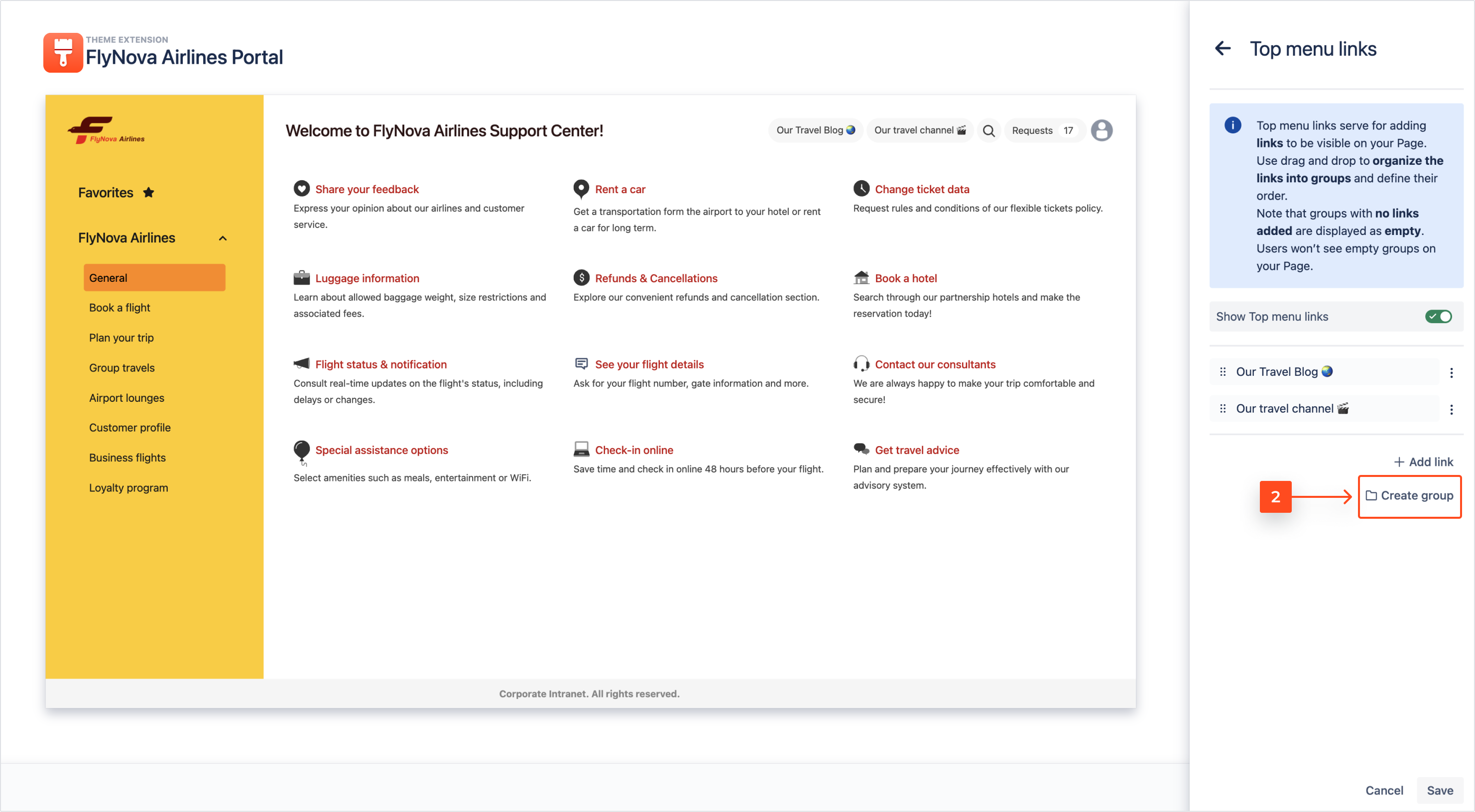
- Access the Top menu links section.
- Click Create group.
- Introduce the Group name which will be displayed to the users of your Page.
- To save the introduced name, click the tick icon.
By clicking the cross icon, the introduced Group name will be permanently lost.
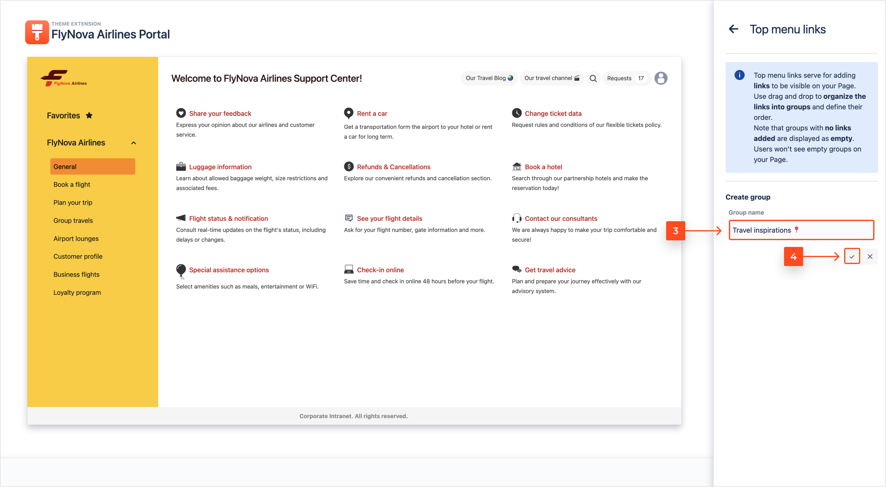
- To add links to the created group, use drag and drop.
- Store your configuration of links in the Top menu by clicking Save.
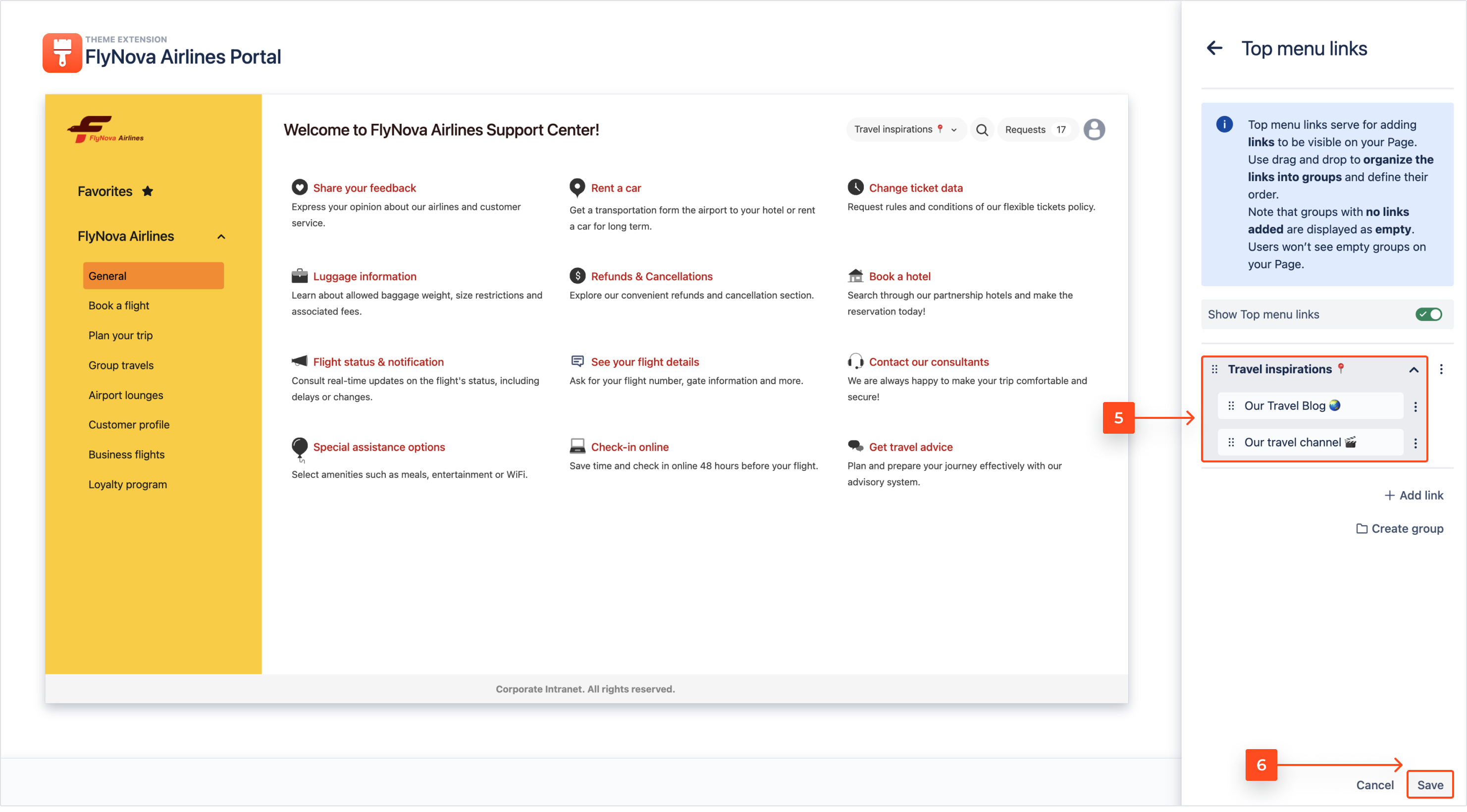
Result
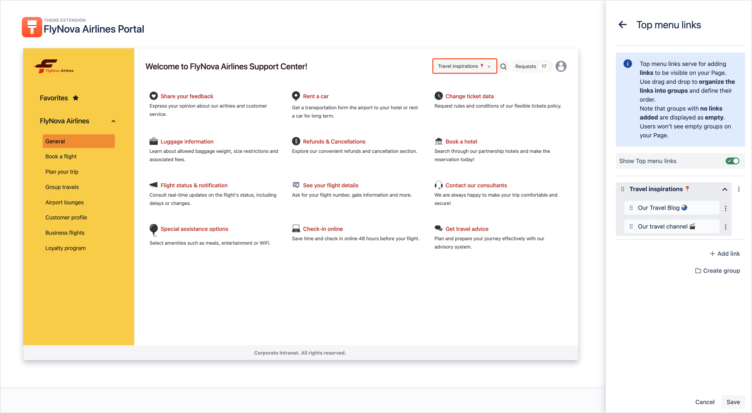
Your group is created and it contains selected links.
Searcher
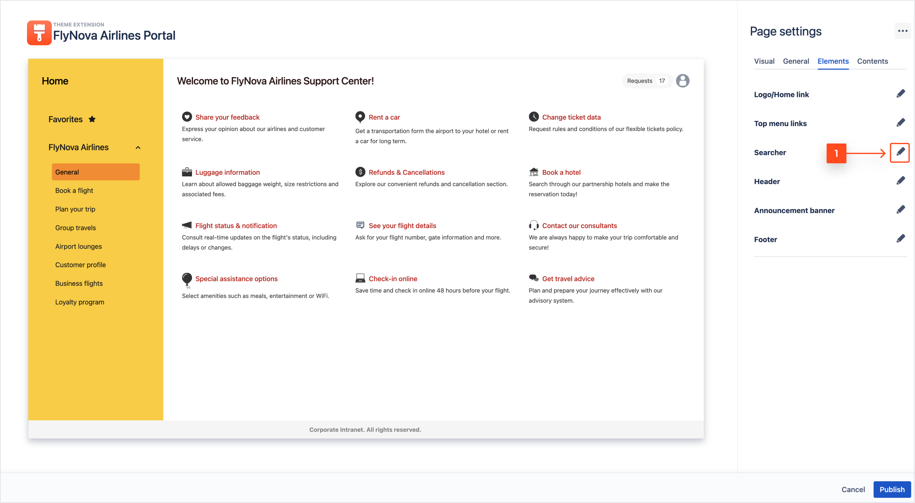
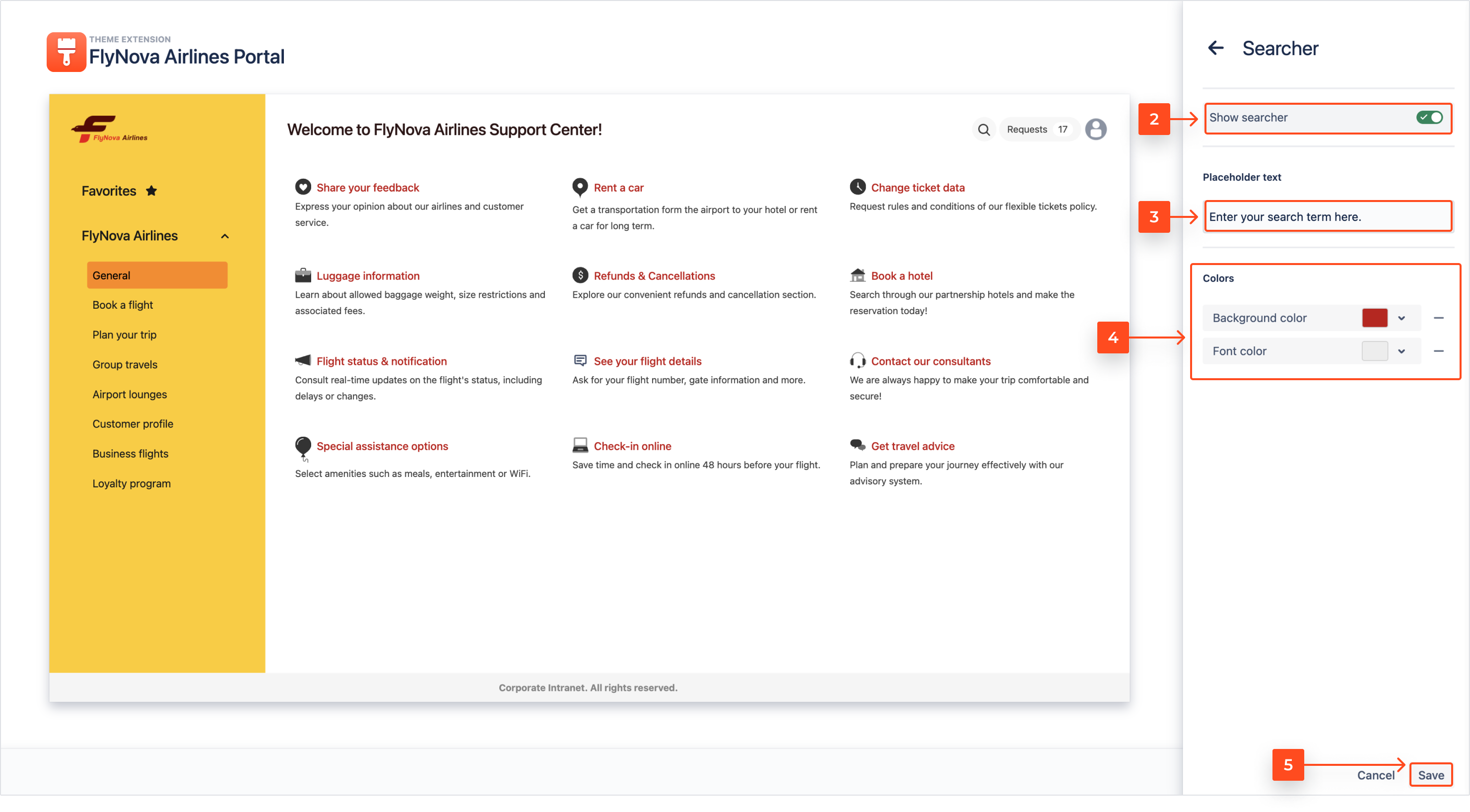
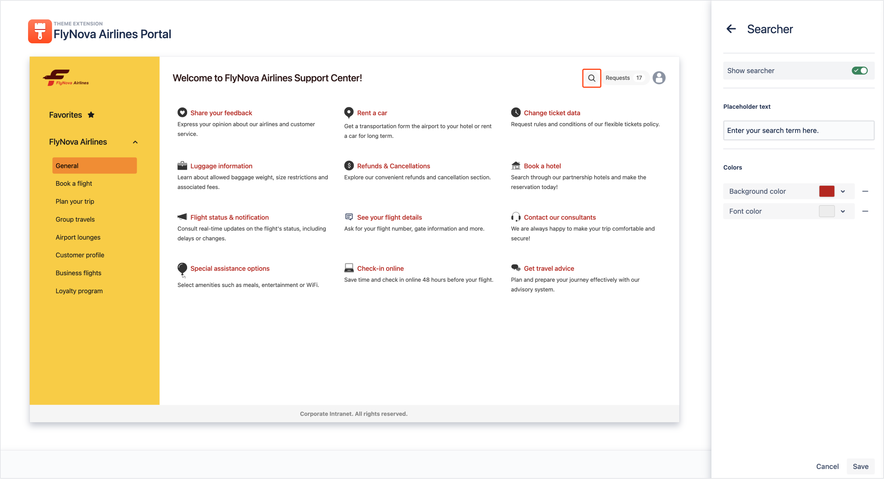
To understand the search bar configuration, follow the steps below.
Steps
-
Turn on the toggle if you want to add a search bar to your Page.
-
Optionally, you can create a custom Placeholder text to be visible in the search bar.
-
Set the colors of the search bar using the color picker, HEX code, or RGB codes.
Result
The search bar is configured and its icon is visible on the Page editor view.
Header
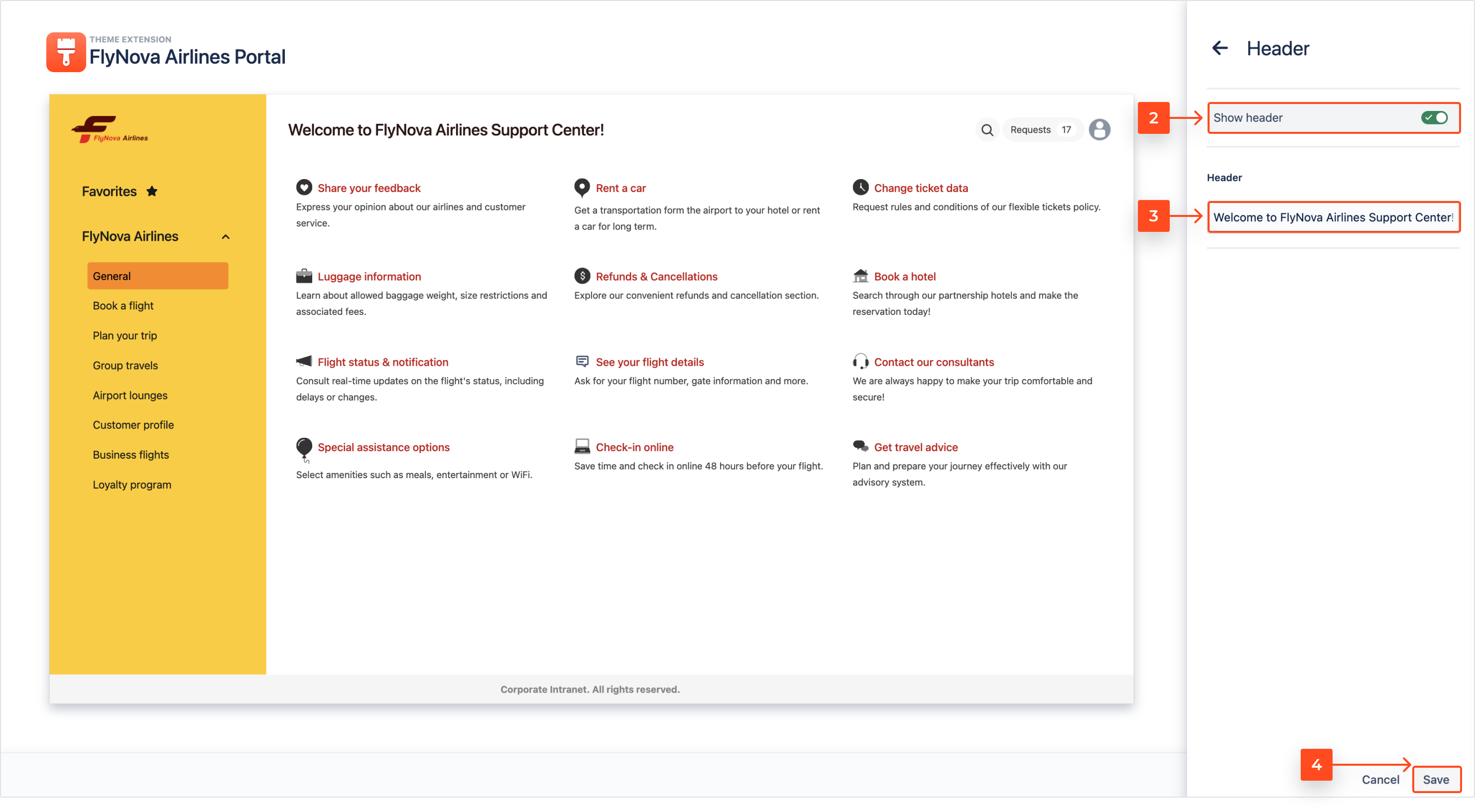
To learn how to customize the header element of your Page, go through the steps below.
Steps
- Click on the pen icon to expand the Header panel.

- Use the Show header toggle to decide about the header visibility on your Page.
- Change the text of the header.
- Click Save.
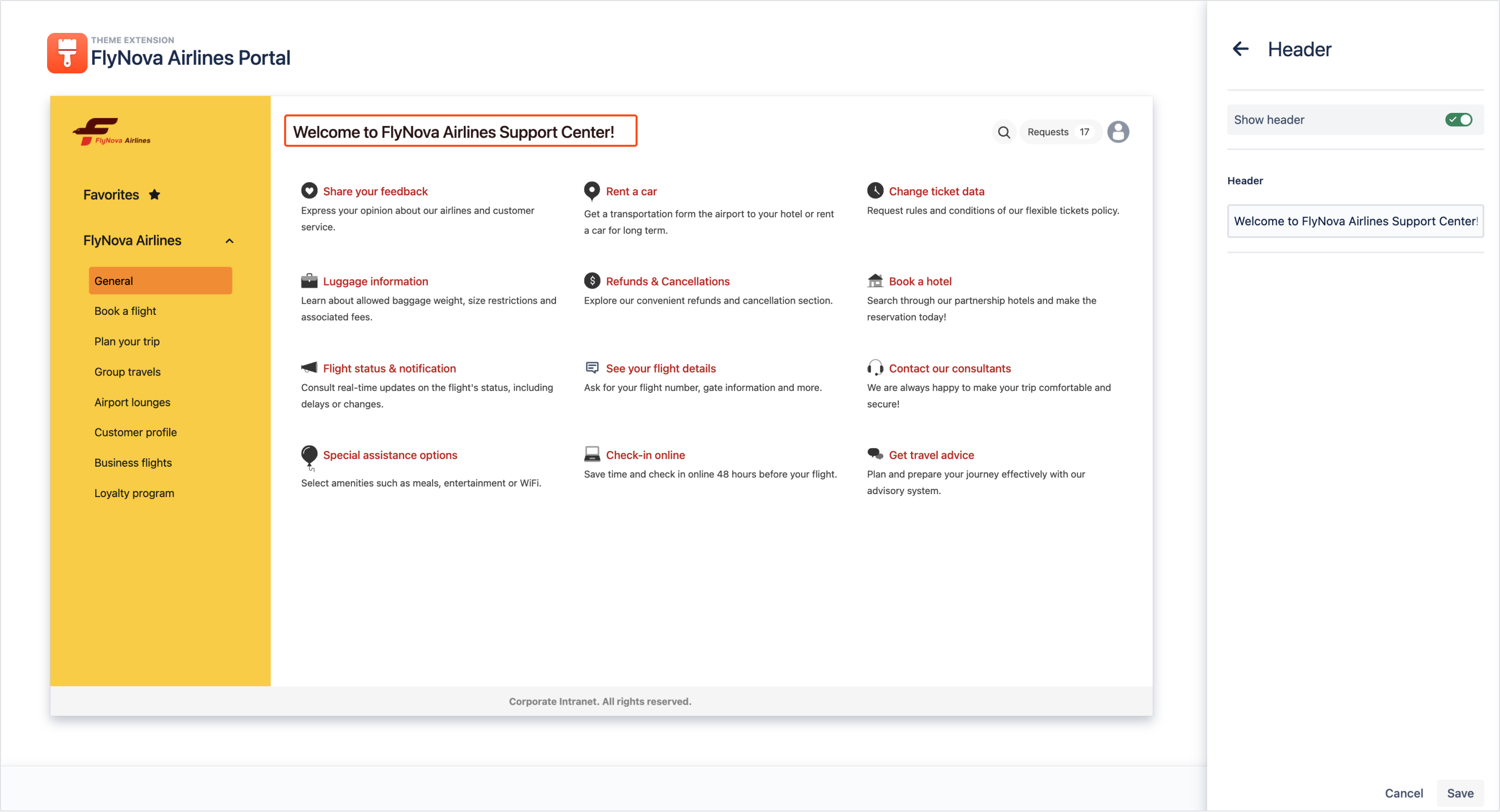
Result
The Header element of your Page is configured.
Announcement banner
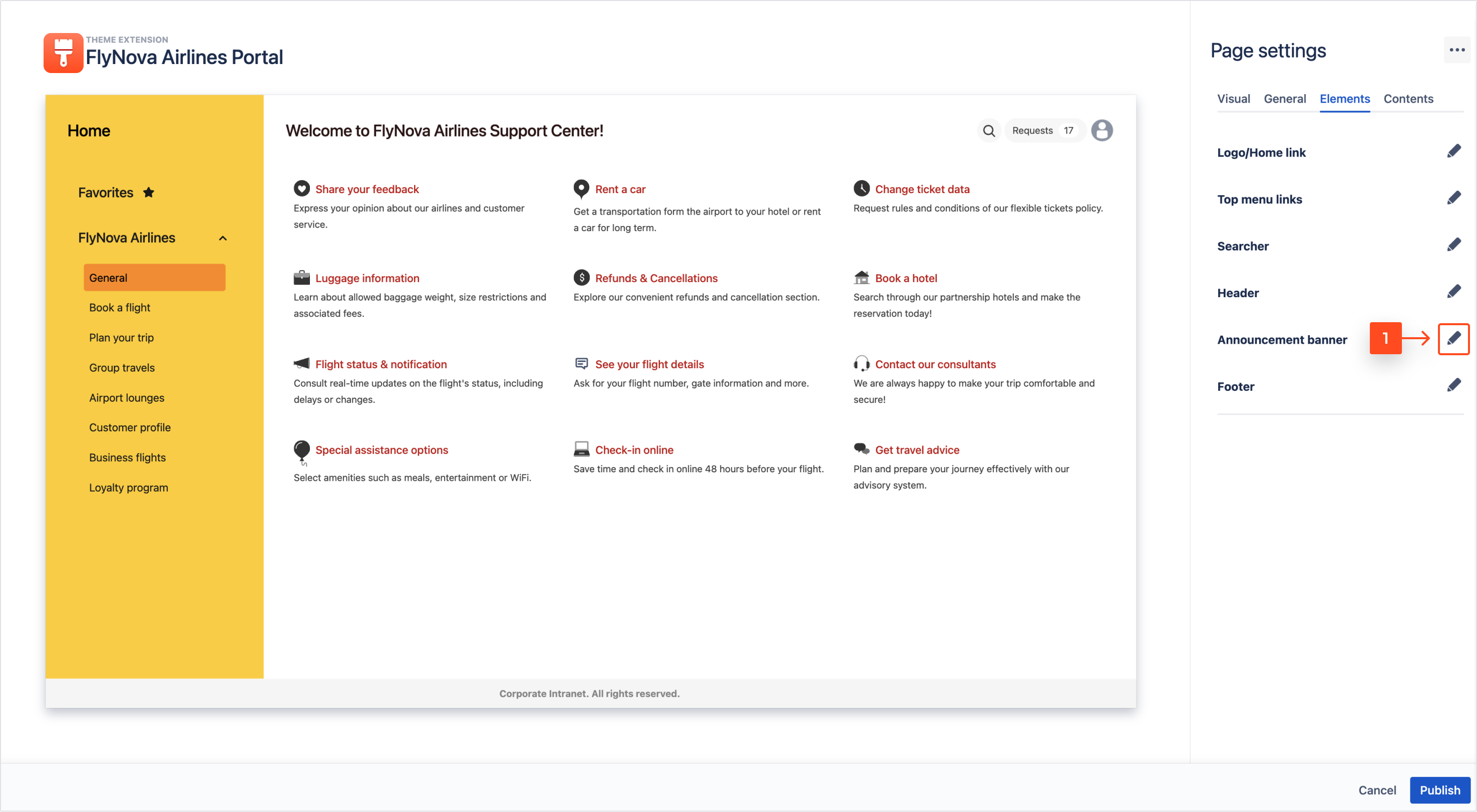
Steps
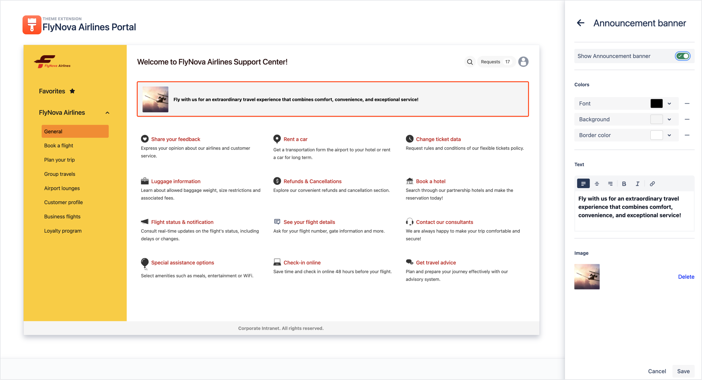
- Click on the pen icon to expand the Announcement banner panel.
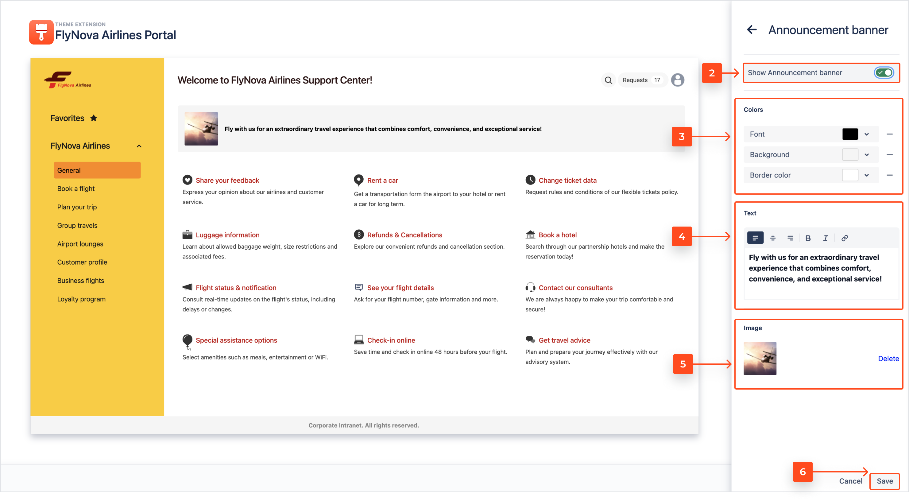
- Turn on the toggle to display the announcement banner.
- Choose the colors of the font, background, and border.
Note
Default colors of the announcement banner are inherited from the Navigation section colors.
- Enter the text of the banner. You can format it using the Rich text editor.
- Upload an image.
Note
- Maximum dimensions are 32x32 pixels.
- Supported formats are JPG, JPEG, PNG, HEIC.
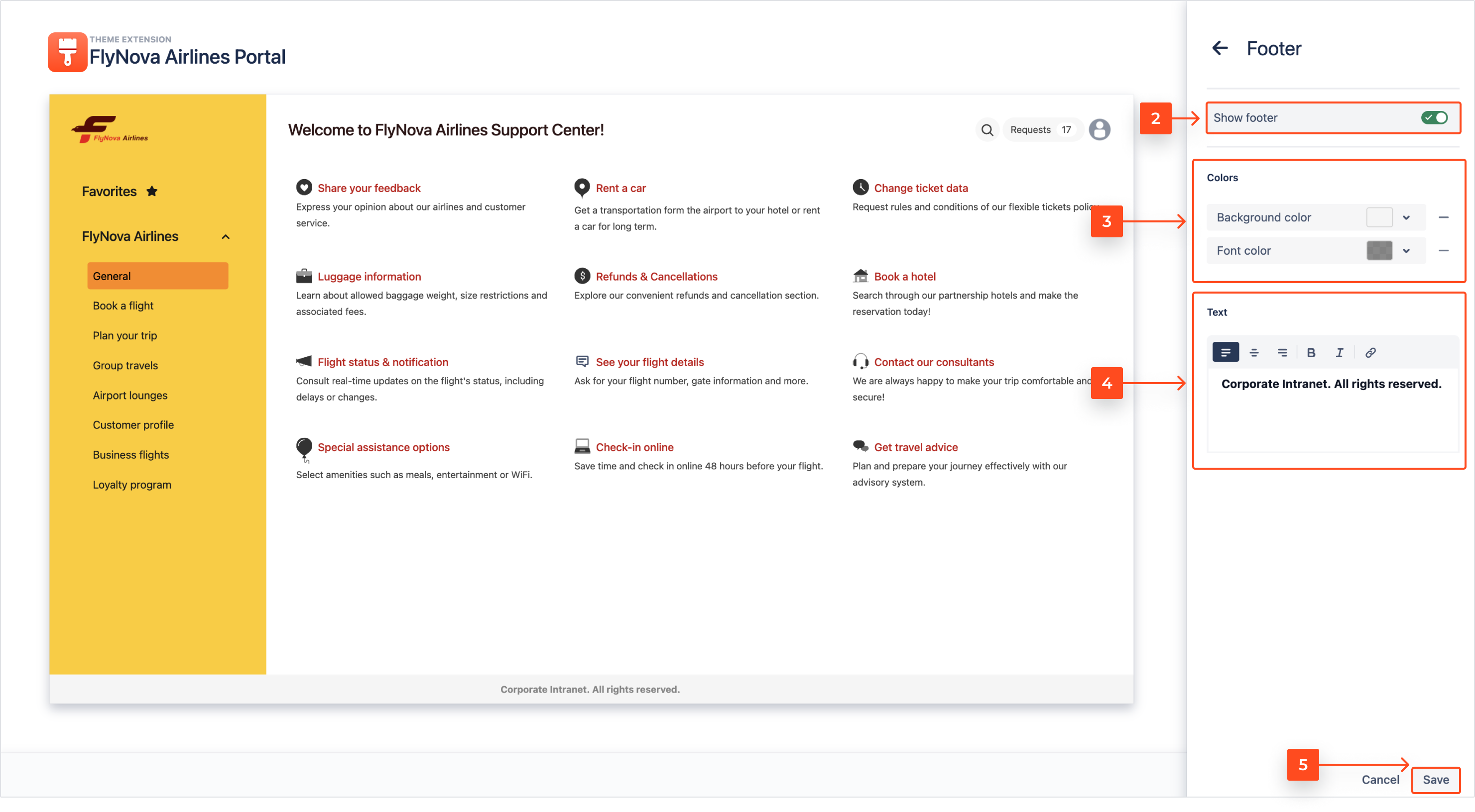
- Click Save.
Result
The Announcement banner of your Page is added.
Footer
Steps
- Click on the pen icon to expand the Footer panel.
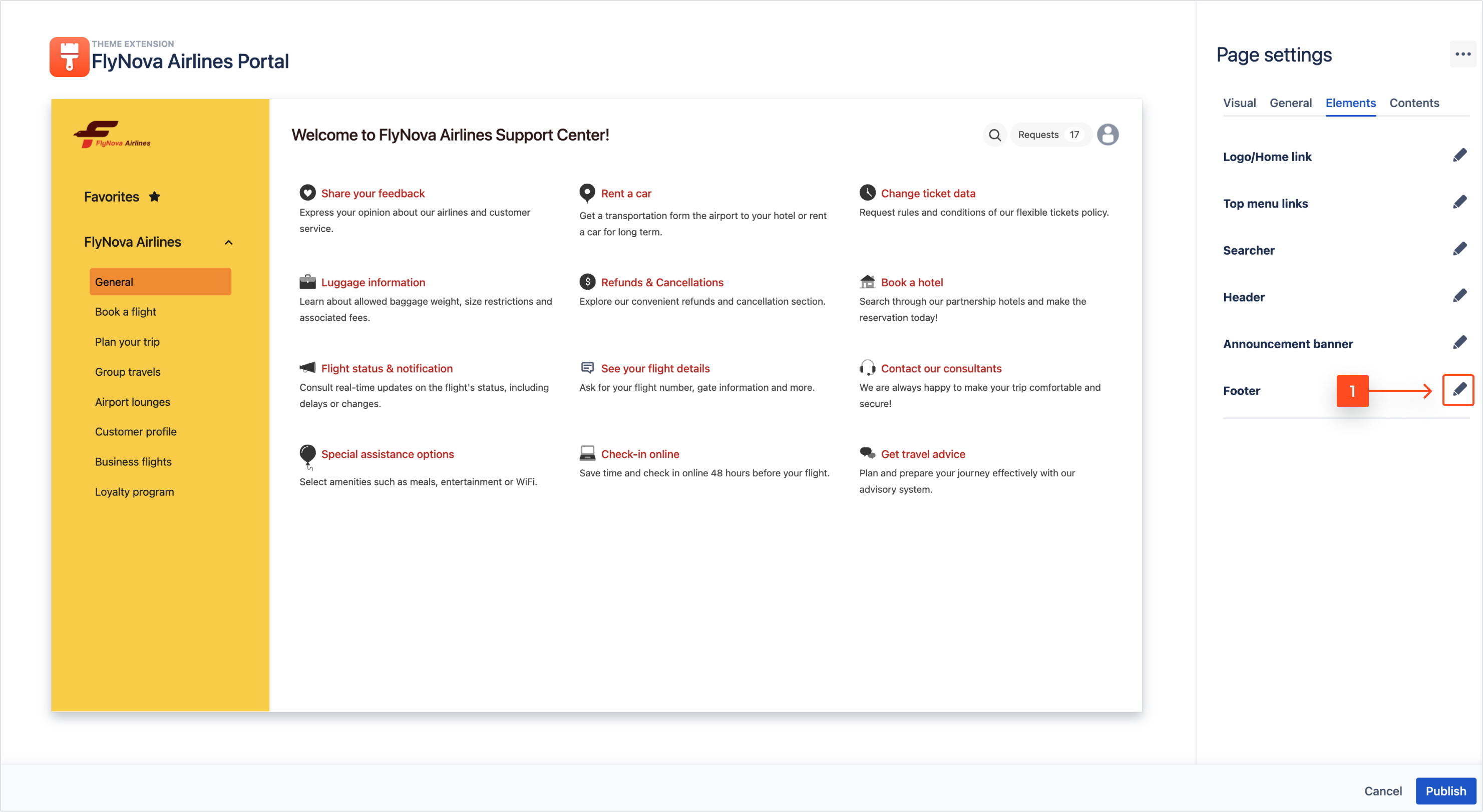
- Turn on the toggle to display the footer.
- Choose the colors of the font and background.
Note
Default colors of the footer are inherited from the Main section colors.
- Enter the text of the banner. You can format it using the Rich text editor.
Result
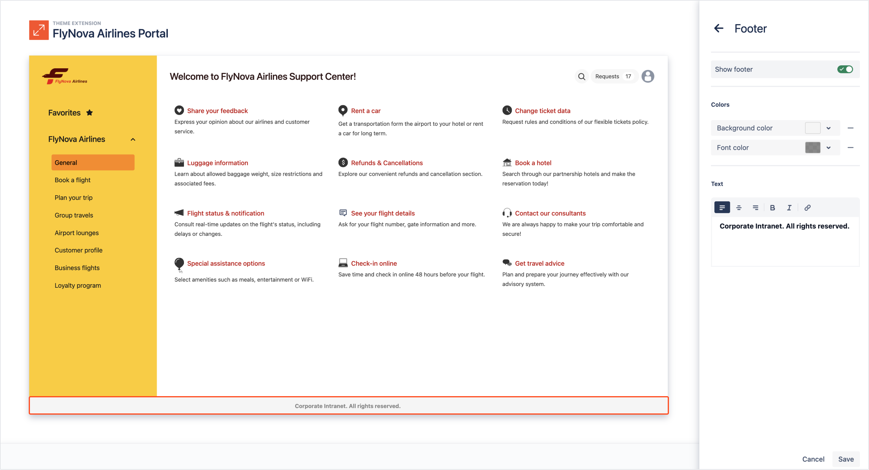
The Footer element is added to your Page.
Next up
To finish the Page configuration, proceed to publishing. You can also continue editing by accessing the Contents category of the Page settings.
